Background
clubpro is an implementation of a subset of the methods
described in Grice (2011) for classification of observations using
binary procrustes rotation. Binary procrustes rotation can be used to
quantify how well observed data can be classified into known categories.
A high degree of classification accuracy indicates that the ordering of
the observed data is well explained by particular categories or
experimental conditions.
Set up
clubpro can be installed from CRAN with the command
install.packages("clubpro") and loaded in the usual
way.
The plots provided by clubpro use the colour palette
loaded in the current R session. You may specify the plot colours by
passing a vector of colours to palette().
Classifying catch location by jellyfish size
Hand et. at. (1994) provide data on the width and
length in mm of jellyfish caught at two
locations in New South Wales, Australia:
Dangar Island and Salamander Bay.
To quantify how well jellyfish width is predicted by
catch location, binary procrustes rotation can be performed
with clubpro by passing a formula object of
the form observed variable ~ predictor variables(s) and a
data.frame containing the data to the club()
function.
mod <- club(width ~ location, data = jellyfish)The two most important statistics returned by the club()
function are the percentage of correct classifications (PCC), and the
chance-value.
The PCC is the percenatge of observations in the data which are
classified into the correct category. The PCC returned by
club() can be accessed using the pcc()
function.
pcc(mod)
#> [1] 84.78261
The chance-value is computed using a randomisation test to determine
how frequently a PCC at least as high as that computed for the observed
ordering of data is found from random reorderings of the data. Calling
the cval() function on an object returned by
club() shows the chance-value of the model. Note that
because the chance-value is computed using a randomisation test, the
value will be slightly different each time the model is run.
cval(mod)
#> [1] 0.011
More detailed classification model results can be returned using the
summary() function. Note that values in the
summary output are rounded according to the
digits argument to summary which defaults to
2.
summary(mod)
#> ********** Model Summary **********
#>
#> ----- Classification Results -----
#> Observations:  46
#> Missing observations:  0
#> Target groups:  2
#> Correctly classified observations:  39
#> Incorrectly classified observations:  7
#> Ambiguously classified observations:  0
#> PCC:  84.78
#> Median classification strength index:  1
#>
#> ----- Randomisation Test Results -----
#> Random reorderings:  1000
#> Minimum random PCC:  52.17
#> Maximum random PCC:  86.96
#> Chance-value:  0.01
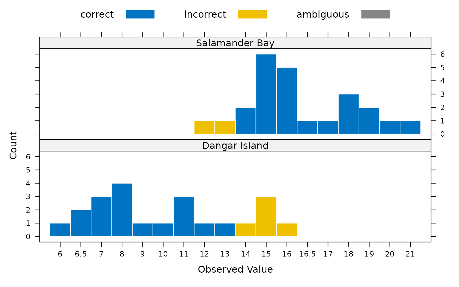
The classification of the observed data can be visualised by plotting
the model object using the plot() function.
plot(mod)
Plotting the classification results shows that observed
width values of 11 mm and smaller are consistently placed
into the Dangar Island category, while observed
width values of at least 16.5 mm are all placed into the
Salamader Bay category. From these results we can see that
the boundary between the two categories is somewhere between 11 and
16.5. However, it is not clear from the plot exactly where the most
likely boundary falls. Grice et. al. (2016) suggest that in the case of
binary classification, the optimal category boundary can be determined
by calculating a PCC for each possible boundary location. This can be
achieved using the threshold() function.
threshold(mod)
#>     obs      PCC
#> 1   6.0 54.34783
#> 2   6.5 58.69565
#> 3   7.0 65.21739
#> 4   8.0 73.91304
#> 5   9.0 76.08696
#> 6  10.0 78.26087
#> 7  11.0 84.78261
#> 8  12.0 84.78261
#> 9  13.0 84.78261
#> 10 14.0 82.60870
#> 11 15.0 76.08696
#> 12 16.0 67.39130
#> 13 16.5 65.21739
#> 14 17.0 63.04348
#> 15 18.0 56.52174
#> 16 19.0 52.17391
#> 17 20.0 50.00000
Plotting the object returned by threshold() shows that
three adjacent category boundary locations produce equal maximum PCCs.
This indicates that the optimal category boundary for classification
occurs between 11 and 13 mm.

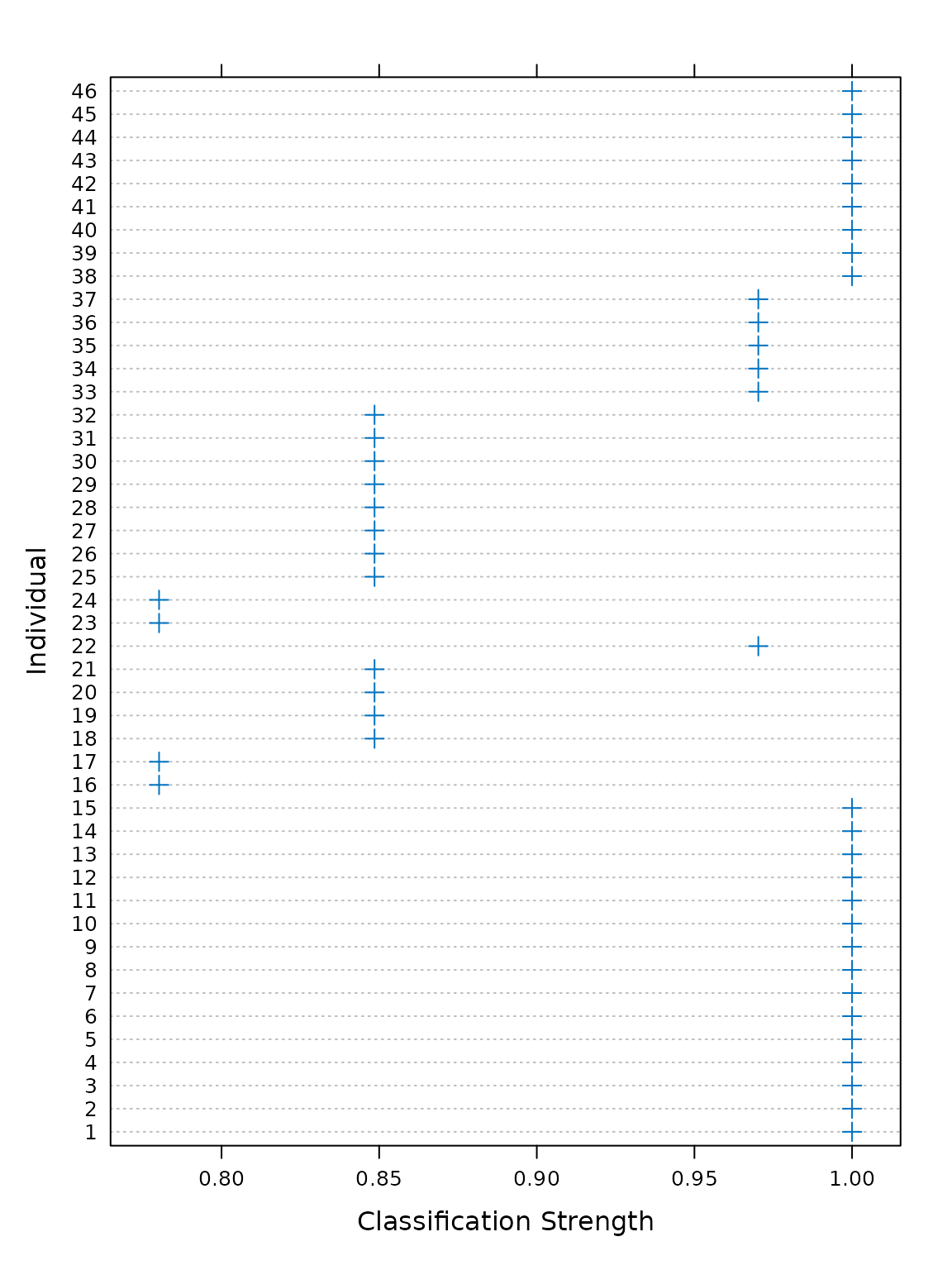
For each observation, a classification strength index (CSI) between 0
and 1 is returned. A value of 1 indicates that an observed value was
matched perfectly by the rotation, whereas lower CSI values indicate
that observations were matched less well. The CSI values can be accessed
using the csi() function, or visualised by plotting the
object returned by a call to the csi() function.

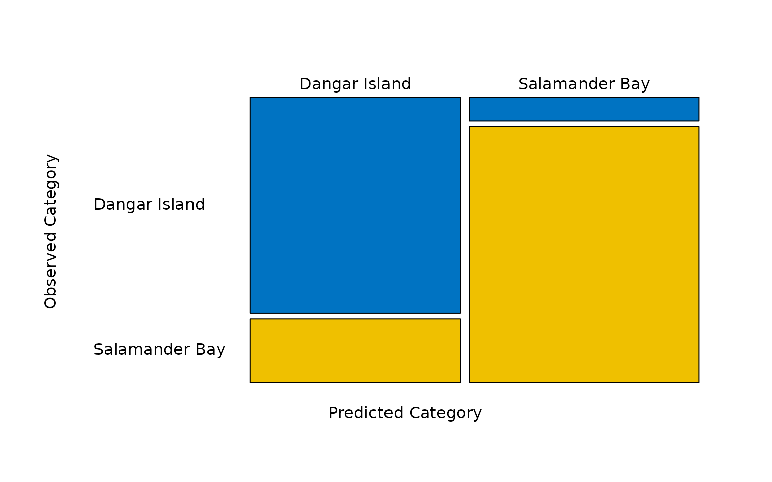
The predicted categories determined by the model can be tabulated
using the predict() function. In this case, of the 22
jellyfish caught at Dangar Island, 17 were classified as
having come from Dangar Island and 5 were classified as
having come from Salamander Bay. Of the 24 jellyfish caught
at Salamander Bay, 2 were classified as having come from
Dangar Island and 22 were correctly classified as having
come from Salamander Bay.
predict(mod)
#>
#>                  Dangar Island Salamander Bay
#>   Dangar Island             17              5
#>   Salamander Bay             2             22
These predictions can be visualised as a mosaic plot by plotting the
object returned by the predict() function.

The same information can be tabulated in terms of prediction accuracy
using the accuracy() function.
accuracy(mod)
#>
#>                  correct incorrect ambiguous
#>   Dangar Island       17         5         0
#>   Salamander Bay      22         2         0
As with predicted categories, prediction accuracy can also be plotted
in the form of a mosaic plot using plot(accuracy()).

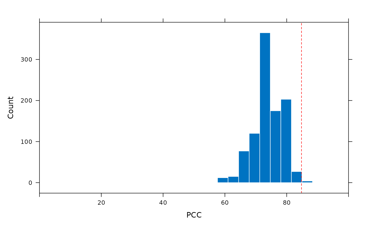
The calculation of the chance-value as the frequency of occurance
PCCs from randomly reordered data at least as high as the PCC of the
observed data ordering can be visualised by plotting the output of the
pcc_replicates() function. Calling the plot()
function on the output of pcc_replicates() produces a
histogram of the PCCs resulting from all random orderings of the data.
The chance value calculated by the model is the frequency with which
PCCs produced from random reorderings of the data are at least as high
as the PCC produced by the observed data ordering, indicated in the plot
by a dashed vertical line.
plot(pcc_replicates(mod))
References
Grice, J. W. (2011). Observation oriented modeling: Analysis of cause in the behavioral sciences. Academic Press.
Grice, J. W., Cota, L. D., Barrett, P. T., Wuensch, K. L., & Poteat, G. M. (2016). A Simple and Transparent Alternative to Logistic Regression. Advances in Social Sciences Research Journal, 3(7), 147–165.
Hand, D. J., Daly, F., Lunn, A. D., McConway, K. J. and Ostrowski, E. (1994). A Handbook of Small Data Sets. Chapman & Hall.